Sept 2019: Multi-touch Tutorials, Part 2 — Successes
In the first part of this blog, we talked about all of the unexpected pitfalls we encountered as we tried to teach players our touch controls. Today, we’re going to examine some of the ways which helped us turn our tutorial around and get to the near-100% comprehension rates that we’ve been enjoying at recent conventions.
Lesson 1: Write your text as if it will be skimmed
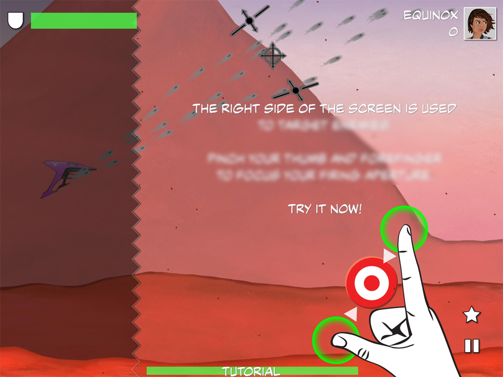
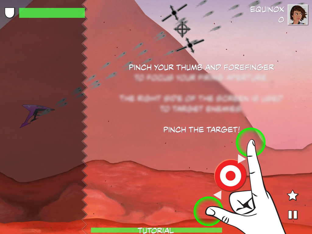
I’ll start with a quick tip that isn’t exclusive to a touchscreen, but helped us anyways: any time you do wind up using text, pretend that everything but the very start and very end is too blurry to read, and see if the most important points still come through.
Lesson 2: Explain first, trim later
During the early-middle stage of development — after we were showing explanatory text, but well before people were really understanding how to play on their own — we’d fairly commonly get player complaints that they didn’t like getting hit with text and would rather just be allowed to play the game. And, having been interrupted by many a tutorial myself, I was already primed to take them at face value.
But… watching players closer, I realized something: if you give a player some helpful text that some didn’t need, they might complain, but they’ll shrug it off and keep playing. Conversely, though, if I omitted something that some players couldn’t figure out on their own, they’d just get frustrated and would move on to the next game unless someone in the booth was able to step in and help them.
It seems obvious in hindsight, but it was a turning-point realization for our tutorial.
Now… once you’ve got everything you need set out in your tutorial, omitting nothing, your job isn’t done. At this point, you can start looking for places where you can detect whether a player has already figured out a skill on their own and start quietly dropping steps from the tutorial.
At PAX South 2019, we went showed the game off with a tutorial that left out no detail, and stopped to watch what players were figuring out on their own before going back and finding spots where we could trim. By PAX East, we had a check in place and only skipped the prompts showing players that they could also expand the firing aperture if they had already demonstrated that ability on their own.
Lesson 3: Subtlety is overrated
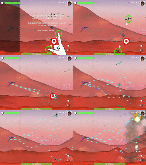
One lesson it took an embarrassingly long time to learn? When you’re working with a tablet, make your hint hands the size of actual human hands.
Not even close.
Don’t waste time playing around with icon-sized little pointers or dots or arrows leading the way. That might work for a game that mimics mouse clicks, but it’s not going to cut it when you’re trying to teach a player gestures.
No. BIGGER.
It feels like a bit of a brick to the face, but you know what? Some players just need to be hit in the face with that brick. Make your hands big from the beginning, and if you need to change anything to make that look good, do so without shrinking the hands.
This is how big your hint hands need to be.
Lesson 4: Hold their hands, as literally as possible.
While it isn’t possible (yet) to program a tablet to physically grab a user’s hand to guide them through the gestures they need to make, there are a few tricks you can do to achieve the next-best thing.
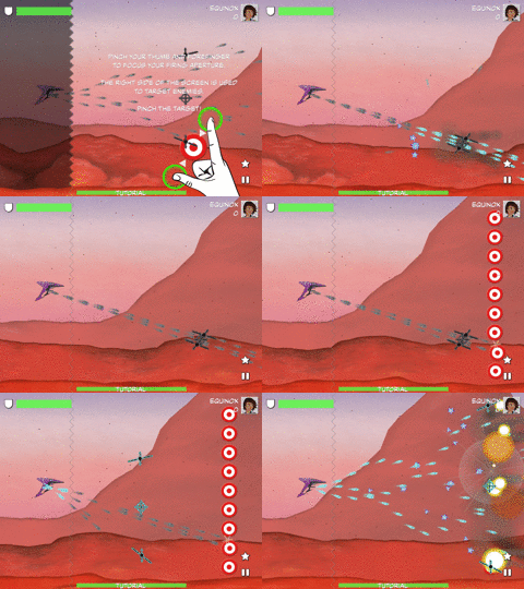
The first step is to get the players to touch the screen in the right region(s) with as many fingers as they will need for the gesture you’re trying to teach. After trying a few different options, this is what worked the best:
Provide a clear and consistent visual cue of where to touch — in our case, we told players to “follow the green circles” and then laid those green circles on top of our brick-in-the-face hint hands
Bring the action to a complete stop until the user has placed all of the fingers on the screen needed to start the gesture
Starting off with a simple single-finger tap gesture to ease the user into things.
Easing the player into the notion that yes, this touch screen in front of you? You’re welcome to touch it.
The second step was to “hold their hand” through the rest of the gesture, and we had our best successes by:
Using arrows and subtly nudging the green circles toward where the fingers should move
Bringing the action back to a complete stop if a user ever took their finger(s) off the screen before completing the gesture.
