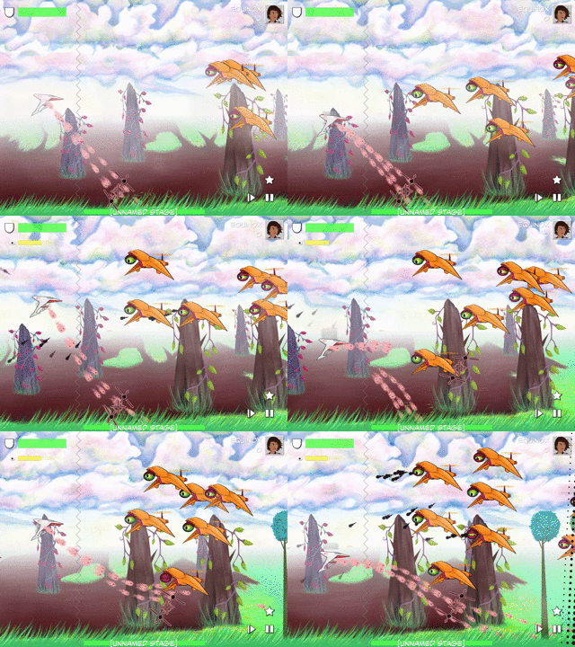
Mar 2021: Coordinated Attacks
The Day We Fought Space features enemies ranging from dead simple objects that do nothing but drift through space to enemies with dozens of points of articulation that respond to the actions of the player. Today I’d like to share some of the ways we plan out and organize the latter.
There are a few general principles we use when we’re making an enemy:
Build complex behaviors out of simple behaviors
Build complex objects out of simple objects
As an example, while there are a number of enemies that surround the player in an attack formation, there is no behavior flag called “surround the player in an attack formation,” but a number of simpler behaviors. To start, we have an invisible object with the instructions “target the player” and “move to meet my target.” Then we have the ships in that formation, with the instructions “this invisible thing is my commander,” “set all motion relative to my commander,” and “position myself at point X in a formation.”
Pairing this two-level, four-command structure with different maximum speed and acceleration parameters gives us a lot of control over fine-tuning the feel of the enemies’ response, as well as cutting down on duplicated code and opening the door for us to programmatically vary enemy behaviors — but the flipside is, if you’re looking just at the datafiles itself, it can be tough to figure out what’s going on. Tough to do higher-level things like pacing curves and whatnot, unless you’ve got a way to organize everything. To orchestrate the different parts and the different behaviors.
This is the notation system I came up with to help me organize this. It’s nothing super fancy, nor is it a particularly rigid system, but it’s fun to talk about and maybe it’ll help someone to see it in action.
Example 1: Twin-Cannon Ships
An earlier version of this ship acted as a single rigid body, but in a recent upgrade we separated out the two cannons so we could use the physics engine. This is one of the more straightforward charts, for two reasons. First, the ship doesn’t have to respond to anything outside of its own collection of parts — anything that it does (except for exploding), it does strictly on its own terms. Second, all of the “orders” come from the same parent game object.
Early planning docs used state diagrams for planning, and I had hoped to find them but I’m not sure exactly what notebook they wound up in, so here is a re-creation:
There were a couple shortcomings with this tried-and-true method. First off, trying to notate exactly what needed to happen at each state, and which object was in charge of which transitions, made the chart get messy fast. Second, adding the “small” states needed for subtle things like enemy tells and other pacing-related adjustments was cumbersome in this format. For later design, I used a view that was inspired by musical scores — similar to an animation timeline, but with the ability to squash and stretch the sections that needed more notation. This is a cleaned-up view of what it looks like (I’ll spare you from trying to read scribbled notes through eraser marks on paper):
Brackets for repeated sections like the inner attack loop, open circles for “observations” — things that could trigger a new state, closed circles for behavior changes, stars for instantaneous events, bars extending to indicate the pertinent time intervals.
Example 2: Eyeships
Full disclosure: these guys are buggy in the latest build… which is part of the reason I’ve been digging into these enemy diagrams lately.
Eyeships add a couple wrinkles to the formula. First off, external stimuli can interrupt the normal sequence in a couple ways: finding the player, losing track of the player, and (understandably) getting shot in the eye all require the enemy to change its behavior. First off, commands can come from different parts of the ship: the main body of the ship, which controls movement and general decision-making, as well as the eye which has to report when it sustained damage.
In this case, the state diagram doesn’t convert quite so readily into a single line:
Trying to put everything onto a single timeline would get messy, with a bunch of “jump to this or that marker” notations. Making every state its own timeline would just make things work. But… if you follow the arrows, you can see some patterns emerge. I like to rethink the state diagram more in terms like a public transit map:
Framed this way, it’s much easier to see that there are three “tracks” that happen more or less sequentially with minimal jumping between the tracks — and furthermore, the blue and green tracks can be combined without adding too much noise, so here is the full* notation for the eyships:
* well, not quite… there is also a ‘flinching’ mechanic that has been removed for simplicity.
Hopefully this notation system helps someone — let me know if you have any successes with it, or if you come up with your own helpful tweaks to the general system!


